 This is the masthead for Mojo. Like most magazine mastheads the font is capitalised and bold. By having this bold capitalised masthead it draws in the readers attention and when on the front cover of the magazine it is easy for the reader to notice above the main image and all other information featured on the cover. This example of the masthead is black but it is sometimes changed to white to contrast against coloured backgrounds on the cover. There isn't a distinct stroke (outline) however there is slight shadowing around the letters to give it a 3D effect to allow it to stand out more on the page. Other than the shadowing the masthead is quite plain and simplistic. When looking at the magazine cover, the masthead is bold and is contrasting to other colours on the page.
This is the masthead for Kerrang!. The font is capitalised and bold, drawing in the readers attention on the page. By using a capitalised font, it resembles the idea of shouting or being loud, which is what most readers would relate to Kerrang! for featuring bands who's music is known for being played loudly. The colours of the masthead occasionally change to contrast the background of the front cover. This colour change usually also affects the house style of that issue, the colours of the front cover and main feature article being based around the colours. Kerrang! uses a smashing effect on the masthead, relating possible to the idea of a guitar smashing or a visual of a crash of a cymbal. The Kerrang! brand is spread also across a radio station and a television channel, by publishing a magazine with the same logo on it, the word is spread about these other two media platforms used by the brand.
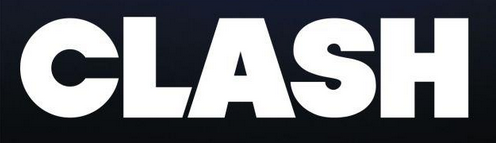
This is the masthead for Clash. Like most magazine mastheads the font is capitalised and bold, however some letters appear to be larger than others. The letter 'c' at the start of the masthead appears over curved but within the letter appear a shape similar to that of a microphone, linking into the theme of music. Part if the capitalised 'L' is angled against the shape of the 'A' next to it. The Clash masthead is almost always white with very little variation. As a not very well known magazine the masthead takes up most of the front cover.
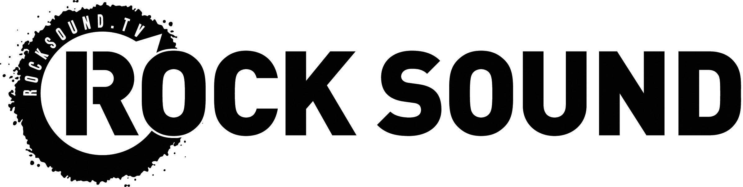
This is the masthead for Rock Sound. The font is capitalised and bold. There is a very slight space between two parts of the 'R', giving a stencilled affect, similar to the seemingly sprayed circle around the letter with a small triangle missing from the circle. This circle looks like a volume dial turned to full, linking to how the music which the magazine covers is meant to be loud. The main colours of the masthead are black and white but are occasionally changed to fit the house style of that issue to avoid the masthead blending in with the rest of the front cover.
No comments:
Post a Comment