Front Cover
Main image
For my main image i plan on featuring three models representing a female fronted band with one male band member. I will position the female models further forward than the male model to show how the females are the more superior characters within the band. One female model will be positioned in the middle of the page with her eyes facing forward to appear that they are looking at the reader. The other female model will be placed to the left of the "lead role" of the band, facing her and appearing to whisper in her ear while she looks over her hand at the reader. My singular male model will be on the right hand side of the female lead. In terms of the rule of thirds the two female roles will appear in a more superior position to the male role. The male role will be leaning in towards the female lead almost appearing to be listening in trying to hear what one is whispering to the other.
Masthead
Decided name for my magazine:
- Double Dare
I want my masthead to be all in capitals and in a distorted font. By having my masthead in a distorted font, it will link into the idea of the distorted guitars featured within the Pop-Punk genre. I will use a dark or muted colour to make the masthead stand out from the background of the image.
Colour Schemes
I plan on making my masthead orientate around royal blue, I also plan on featuring burgundy or maroon as a secondary colour on my front cover. I will alternate the colours for my main sell line, and will incorporate black and white into my colour scheme too, allowing a separation and to break away from having too much colour on my front cover.
Contents Page
Images
I plan on having two images on my contents page, one of my main feature which will be on my front cover and double page spread, and another of a secondary mentioned feature which will appear as a puff on my front cover.
colour scheme
layout
I plan on having my table of contents on the left hand side of the page so that when reading the page it is the first thing the reader will see. I will divide my table of contents into different categories to make it easier for the reader to find the articles they are looking for. The categories I will divide my contents page into will be News, Interviews, Features, Reviews and Live events.
Double Page Spread
Images
I plan on using a high angle shot of my cover feature n my double page spread to show more of the band in the main image. I will also include small images of the band embedded in the text of the article. The main image will include dark costuming either similar to or the same as the front cover.
Drop Cap
I will include a drop cap, possibly in a colour which is included in my main colour scheme such as royal blue or even black.
Pull Quote
I plan on using a quote from my article as a pul quote which leaves some ambiguity to the context of the quote and will make the reader want to read the rest of the article.
Tuesday, 29 November 2016
Costume and Prop Research and Planning
To clearly convey that my magazine is of the Pop-Punk genre, I have researched into the latest fashion trends within the genre. A primary colour within the clothing style is black and leather is a featured material. Leather features itself in items such as boots and leather jackets. Other colours which appear frequently within the Pop-Punk style are white and red, these colours being featured in checked flannel shirts. Black T-shirts are sometimes printed with graphic designs of band names or logos and are often tucked into black skirts when looking at the female side of the genres fashion.
Hair within the Pop-Punk genre tends to be of unnatural colours or black and the male hairstyles appear long, uncontrolled and messy.
Make-up within the genre consists of dark eyeliner and eyeshadow, combined with the application of dark lipstick or gloss. In terms of jewelry, bracelets are worn in a great quantity. A recent fashion trend in the Pop-Punk genre are choker necklaces.

I will have Three models for my front cover so I need to find three similar costume ideas for my models to wear. For my contents page I will need to find a secondary costume choice to represent a different band or artist. I plan on making my costumes appear casual to make the fashion choices relatable to the reader, allowing them to replicate the main image within their own look but with their own interpretation. My models and I have different variations of my costume ideas, such as flannel shirts and leather jackets. So I can request my models to bring their costumes to change in to and I shall bring my own costume for my secondary costume idea.
Monday, 28 November 2016
3 Point Lighting Research
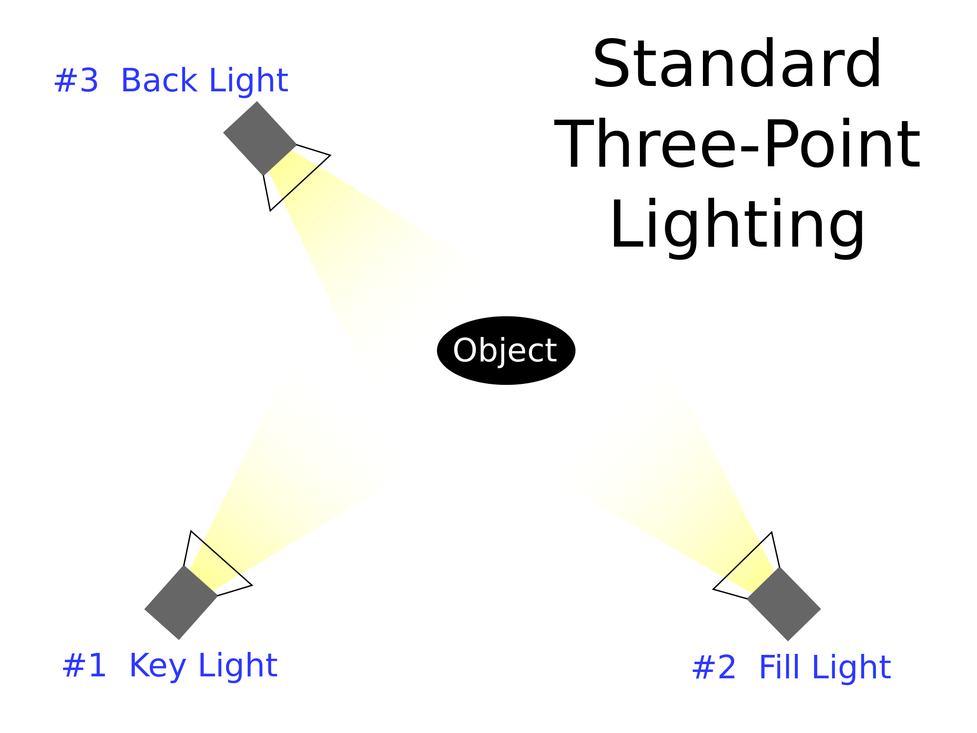
3 point lighting is the use of 3 studio standard lights; the key light, the fill light and the back light. It is a versatile lighting system used in all kinds of visual media.
The key light is used as the main light. It is usually the strongest light and has the most influence on how the shot will look.The key light highlights the form and features of the subject. It is always placed to one side of the camera and object allowing for one side of the object to be lit and the other to have some shadow.
 |
| Key Light Only |
The fill light is the secondary light and is placed on the opposite side to the key light. The fill is used to fill in the shadows caused by the key meaning that the fill light is usually softer than the key light. The fill light makes the contrast between light and dark tones more subtle.
 |
| Fill Light Only |
 |
| Key and Fill Light |
The back light is placed behind the subject, usually to one side and lights the subject from behind. The purpose of the back light is to define and highlight around the subjects outlines, helping separate the subject from the background. With no key or fill light the subject becomes just a silhouette within the shot and no features can be identified.
 |
| Back light Only |
 |
| Key, Fill and Back light |
High Key Lighting:
High key lighting is the use of a lot of strong key lights overpowering the shot. the use of high key lighting usually suggests an upbeat, positive mood within the shot.
Low Key Lighting:
Opposite to high key, low key lighting is the use of few or no key lights, creating a dark shot with very little lighting to suggest a negative or tense atmosphere.

Fill Lighting:
fill lighting reduces shadows within a shot ( a large scale variation of a singular fill light).
How will this research impact my plans?
By doing this research I will plan on using all 3 points of lighting for the main images of my magazine, one key light placed on the right hand side of my subject, a fill on the left and a back light. I will use a white background for my photo shoot as it will be easier to define the subject from the background. I may consider using elements of high key lighting to define the subject even more and will also break away from conventional stereotypes of the genre if I don't use low key lighting.
Masthead Font Research and Analysis
 This is the masthead for Mojo. Like most magazine mastheads the font is capitalised and bold. By having this bold capitalised masthead it draws in the readers attention and when on the front cover of the magazine it is easy for the reader to notice above the main image and all other information featured on the cover. This example of the masthead is black but it is sometimes changed to white to contrast against coloured backgrounds on the cover. There isn't a distinct stroke (outline) however there is slight shadowing around the letters to give it a 3D effect to allow it to stand out more on the page. Other than the shadowing the masthead is quite plain and simplistic. When looking at the magazine cover, the masthead is bold and is contrasting to other colours on the page.
This is the masthead for Kerrang!. The font is capitalised and bold, drawing in the readers attention on the page. By using a capitalised font, it resembles the idea of shouting or being loud, which is what most readers would relate to Kerrang! for featuring bands who's music is known for being played loudly. The colours of the masthead occasionally change to contrast the background of the front cover. This colour change usually also affects the house style of that issue, the colours of the front cover and main feature article being based around the colours. Kerrang! uses a smashing effect on the masthead, relating possible to the idea of a guitar smashing or a visual of a crash of a cymbal. The Kerrang! brand is spread also across a radio station and a television channel, by publishing a magazine with the same logo on it, the word is spread about these other two media platforms used by the brand.
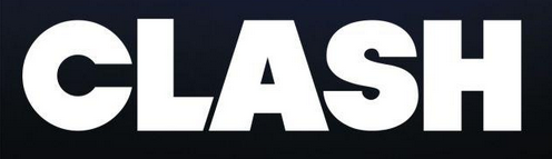
This is the masthead for Clash. Like most magazine mastheads the font is capitalised and bold, however some letters appear to be larger than others. The letter 'c' at the start of the masthead appears over curved but within the letter appear a shape similar to that of a microphone, linking into the theme of music. Part if the capitalised 'L' is angled against the shape of the 'A' next to it. The Clash masthead is almost always white with very little variation. As a not very well known magazine the masthead takes up most of the front cover.

This is the masthead for Rock Sound. The font is capitalised and bold. There is a very slight space between two parts of the 'R', giving a stencilled affect, similar to the seemingly sprayed circle around the letter with a small triangle missing from the circle. This circle looks like a volume dial turned to full, linking to how the music which the magazine covers is meant to be loud. The main colours of the masthead are black and white but are occasionally changed to fit the house style of that issue to avoid the masthead blending in with the rest of the front cover.
Research into a Potential Target Audience- Secondary Research
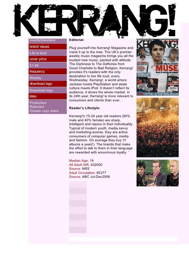
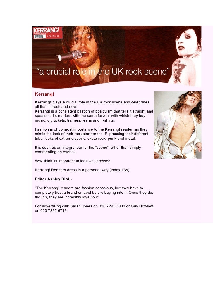
Kerrang! Magazine
Secondary research source: http://www.slideshare.net/belair1981/kerrang-readre-profile
The source of this research was from Slideshare, and does not state that the information is directly from the Kerrang website. Some of the information of the magazine needs updating, for example the selling price of the magazine is no longer £1.99 but is now £2.50. The reader profile states that the age range of readers is between 15 and 24 with the median age being 19 and mostly consistent of male readers ( 60%). According to the reader profile, the shared interests within Kerrang's readers are computer games, media and fashion. The reader profile also discusses the pride the readers have for their identity, "Rejoice in their individuality", and carry a great deal of trust for well known brands and are "rewarded with enourmous loyalty."
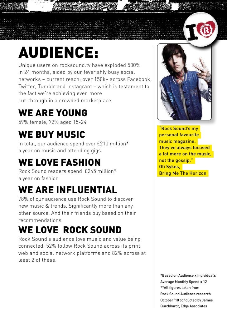
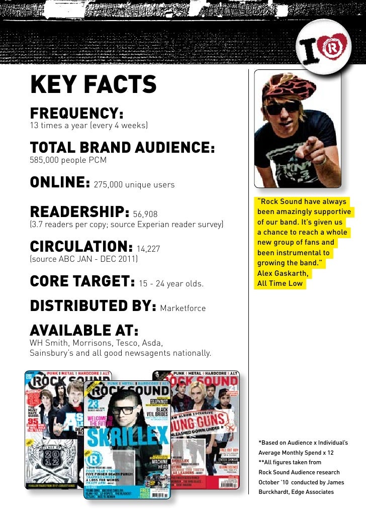
Rock Sound Magazine
Secondary Research Source: http://www.slideshare.net/CrudgeRockSound/rock-sound-2012-media-pack
I have also decided to research into Rock Sound Magazine. Rock Sound is published once every 4 weeks (13 issues a year) at £3.99 an issue, sometimes varying with special issues. Once again the source I used does not declare if it is official information from the Rock Sound website. The reader profile states that the target age range of the audience is also between 15 and 24 years old. Rock Sound however selling to a larger female audience than Kerrang! The profile also states that the audience are interested in fashion and going to concerts. Many readers of Rock Sound use the magazine to discover more bands similar to the ones they already like and it is recognised by members of featured for focusing on the music and not the gossip surrounding the artists.
How Will This Research Affect My Ideas?
By looking at both magazines and their reader profiles, seeing that the audiences of both magazines share interests in fashion, this has inspired me to look at latest fashion trends within the genre, for example the sudden outbreak of ripped jeans, to feature as my costume choices in my featured images. I like the idea of magazines being used by readers to discover new bands and so I may use this information to feature in my contents page. The overarching rock genre seems to carry an audience of people, most of which drawn to the Pop-Punk genre, aged in their late teens and early twenties so I will target my audience at this age group, making my magazine appealing to both males and female, avoiding any possible stereotyping within my magazine.
My Target Audience
Age, Gender and Interests:
My target audience are males and females between the ages of 16 and 24 as I feel more fans within the pop-punk genre are within this age group and by targeting my magazine at males and females I will avoid gender stereotypes within my features. Interests within my audience will be keeping up with the latest fashion trends within the genre, while keeping their individuality and going to concerts and festivals to see their favourite bands and keeping track on media of any sudden trends. They will use my magazine to keep track of new bands which they may be interested in, tours, latest news with bands such as album releases.
Magazine frequency: Every 4 Weeks
Media platforms: Twitter, Instagram, Facebook and the magazines own website
Bands likely to be featured: Neck Deep, Blink 182, New Found Glory, Waterparks.
Aim of the magazine: to keep on top of sudden news within bands such as new album releases and tour announcements. I plan on keeping my magazine focused on the news about the music and the bands other than the gossip in the bands personal lives. I feel the target audience will be more interested in this information as they will want to know when albums are being released and the reviews that come with them and not what is happening in their personal lives. My magazine will also follow in the footsteps of Kerrang! and Rock Sound and give back to the audience by offering posters within the magazine.
Textual Analysis: Part Three
For this presentation of textual analysis, I found that NME does not stick to typical conventions of a magazine and with its minimalist approach there are not many features of the magazine that I could accurately analyse in detail. This means that the content of this presentation is a lot less than the content within my other textual analysis presentations. Where I previously struggled with analysing the double page spread I struggled with even more when looking at NME as no double page spreads follow the usual conventions of the double page spread. This is the least developed of all my textual analysis posts as there is a lot less content for me to analyse in comparison to the other magazines I have analysed.
Monday, 14 November 2016
Textual Analysis: Part Two
Reflection:
In this textual analysis post I still found some difficulty as to what to look for mainly when analysing the double page spread. However, there were different aspects of the double page spread in part two which were not featured in part one. I still found the best amount of analysis from the front page of the magazine as there is still so much more to talk about of what id featured on the front cover and why. Personally, I found this magazine a lot more enjoyable to analyse as I was able to speak a lot about colour and colour schemes within the front cover and contents page. It is difficult to find the right amount of analytical phrasing to feature when looking at the double page spread as there are limited things to analyse. The most analysis I could gather from the double page spread is from the main image which is featured. The images are better to analyse than other features of the magazine as you can talk not only about cinematography but about mise-en-scene too. There is not much variation as to what can be said about the different features of text within the magazine.
Textual Analysis: Part One
Reflection:
For this Prezi presentation, closely analysing the front cover and contents page was easier than analysing the double page spread as I was unaware of what features of the double page spread I was to look at closely. For the second part of my textual analysis I will have to see if there are more aspects of the double page spread that I can analyse to a better extent. I feel I was able to analyse the main images to a better standard than the other elements. The front cover I feel was the better point for analysis as there is so much to talk about on the front cover than the other pages. My weakest point of analysis was the double page spread.
Subscribe to:
Posts (Atom)